Creating Web Demos for Compose Multiplatform Apps
Let’s say you’ve built a Compose Multiplatform (CMP) app that works perfectly on both Android and iOS. Now, you want to create a demo web version to increase downloads. Thanks to Kotlin/Wasm and the KMPDevicePreview library, we can easily make this happen. You can check out a sample web demo of the PianoSpot app, created by these tools.

Kotlin/Wasm allows you to create a web version of your app using the same Compose views, but there’s one issue. When you use Kotlin/Wasm, the view will be shown like it’s on a desktop or big screen. This means users won’t get a true sense of how the app will look on their phone. That’s where the KMPDevicePreview library comes in. It lets us simulate how the app will look on a specific device, making it feel more realistic.
For this demo, I’ll walk through a simple app, but the process can be applied to nearly any Compose app or UI components. There might be some challenges when applying this to every app, but don’t worry — I’ve also shared some of the challenges I faced and how I overcame them in this blog.
Step 1: Set Up Your Project
First, open your existing project. I’m using a simple project generated from the Kotlin Multiplatform Wizard (you can find it here). If your project already includes a WebAssembly (Wasm) target, you can skip the next step. If not, follow these simple steps:
- In your composeApp/build.gradle.kts file, add the WasmJs target:
kotlin {
    androidTarget {
        //...
    }
    //....

    @OptIn(ExperimentalWasmDsl::class)
    wasmJs {
        moduleName = "composeApp"
        browser {
            val rootDirPath = project.rootDir.path
            val projectDirPath = project.projectDir.path
            commonWebpackConfig {
                outputFileName = "composeApp.js"
                devServer = (devServer ?: KotlinWebpackConfig.DevServer()).apply {
                    static = (static ?: mutableListOf()).apply {
                        add(rootDirPath)
                        add(projectDirPath)
                    }
                }
            }
        }
        binaries.executable()
    }

  //....
}
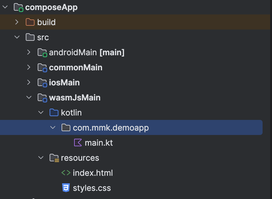
2. Then, create a wasmJsMain directory in composeApp/src. Android Studio will suggest this automatically. Inside wasmJsMain, create the kotlin and resources directories.

In the kotlin directory, create a main.kt file with the following code:
import androidx.compose.ui.ExperimentalComposeUiApi
import androidx.compose.ui.window.ComposeViewport
import kotlinx.browser.document

@OptIn(ExperimentalComposeUiApi::class)
fun main() {
    ComposeViewport(document.body!!) {
        App()
    }
}
In the resources directory, create an index.html file:
<!DOCTYPE html>
<html lang="en">
<head>
    <meta charset="UTF-8">
    <meta name="viewport" content="width=device-width, initial-scale=1.0">
    <title>DemoApp</title>
    <link type="text/css" rel="stylesheet" href="styles.css">
    <script type="application/javascript" src="composeApp.js"></script>
</head>
<body>
</body>
</html>
And a styles.css file:
html, body {
    width: 100%;
    height: 100%;
    margin: 0;
    padding: 0;
    overflow: hidden;
}
3. To run the web version of your project, run:
./gradlew wasmJsBrowserRun
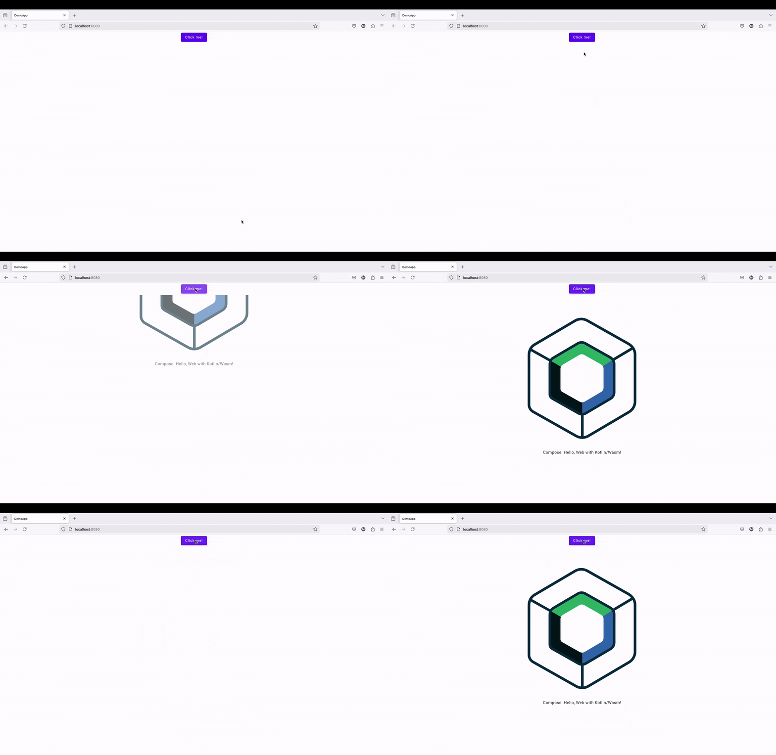
You should see your app running in the browser, but it’s not mobile-friendly yet. We’re not just creating a web version of our app — we’re building a mobile demo version. To achieve this, the next step is to include the KMPDevicePreview library.

Step 2: Add KMPDevicePreview
The KMPDevicePreview library is easy to use and works across Android, iOS, WasmJs, JS, and desktop targets. To add it, include the following dependency in your commonMain:
implementation("com.kappmaker:kmpdevicepreview:1.0.0-alpha02")
Check the GitHub Repo for the latest version — at the time of writing, it’s 1.0.0-alpha02.
After adding the library, run ./gradlew kotlinUpgradeYarnLock command. Otherwise, you might see the following error: > Task :kotlinStoreYarnLock FAILED.
Step 3: Wrap Your Composable with DevicePreview
Now, return to your main.kt file and wrap the root App composable with DeviceWithConfigurationView like this:
DeviceWithConfigurationView {
    App()
}
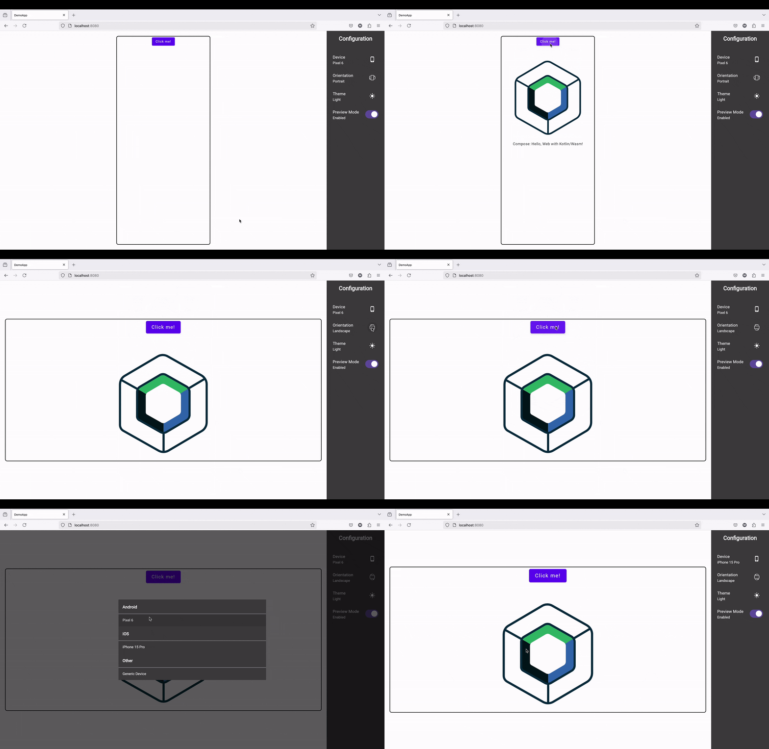
This will simulate the app as if it’s running on a device, giving users a realistic preview of what to expect before downloading:

You can select different device sizes and configurations (portrait or landscape). This lets you show how your app will look on various device sizes.
Advanced Configuration and Challenges I Faced
In this basic setup, we’ve managed to create a simple demo web version of a Kotlin Compose Multiplatform app. However, creating the demo web app for PianoSpot wasn’t without its challenges. Below, I’ll share the advanced configurations I implemented and the challenges I encountered while building the demo web app, along with the solutions I used.
Advanced Configuration
Custom Device Preview
For previewing a specific simulated device without including the configuration view, you can use SimulatedDevicePreview. Here's how it works:
SimulatedDevicePreview(
    simulatedDevice = SimulatedDevice(
        device = Pixel6(), // Use a predefined device or create your own
        configuration = DeviceConfiguration(isDarkMode = true, isPortrait = true) // Set dark mode and orientation
    )
) {
    // Your composable content
    App()
}
In this example, you can either use predefined devices like Pixel6 or create a custom device by implementing the Device interface and overriding its size properties. This gives you the flexibility to test how your app looks on different devices.
Theme Configuration
For testing light and dark modes in the preview, use SimulatedDeviceThemeIsDark.current:
val isDark by SimulatedDeviceThemeIsDark.current
MaterialTheme(colorScheme = if (isDark) darkColorScheme() else lightColorScheme()) {
    // Your composable content
    App()
}
This setup allows you to test how your app behaves in both dark and light mode, ensuring that your design is consistent across different themes.
Challenges
1. Dependencies Not Supporting Wasm Target
A main challenge I faced was the lack of support for certain dependencies when targeting the wasmJs platform. Some libraries, such as Room (for local storage) and RevenueCat (for in-app purchases), do not yet support wasm. This is understandable, given that wasmJs is still in its alpha stage, and not all libraries are expected to support it.
While this could be a problem, the main goal of the demo web app is to showcase the app’s interface and interactivity, not to replicate every feature of the native app. Therefore, excluding unsupported features like local storage and in-app purchases makes sense for the web version.
Solution:
To address this, I came up with two possible solutions:
Simple Solution:
The simpler solution was to create a separate module for the web demo app. Instead of creating a new wasmJs source set in the main composeApp module, I copied the composeApp module and renamed it to webApp. This webApp module only contains a wasmJs source set and minimal dependencies—mainly composable views and navigation—enough for the demo app.
- In the webApp module's build.gradle.kts file, I removed all dependencies that were not wasmJs compatible, keeping only the essentials. If I needed to use a feature from another library that wasn't wasmJs compatible, I simply removed that part or displayed a message informing the user that the feature was unavailable in the web demo.
- The downside to this approach is that when I update a view in the main composeApp module, I have to also update it in the webApp module. However, since the demo app is just for preview purposes, this trade-off is acceptable. You can also create a separate UI module for composables to avoid duplication, but I found that copying the composeApp module and removing unsupported parts was faster and easier.
Complex Solution:
- A more complex approach would involve creating a separate module for each unsupported library, creating abstractions for those libraries, and implementing actual code for supported platforms while providing fallback messages or fake implementations for the wasmJs target. This would keep the project up-to-date with the latest changes, but I felt this approach was overly complicated and didn't provide significant benefits for the demo app.
Creating Web Demos for Kotlin Multiplatform Apps was originally published in ProAndroidDev on Medium, where people are continuing the conversation by highlighting and responding to this story.
[Read on Medium]